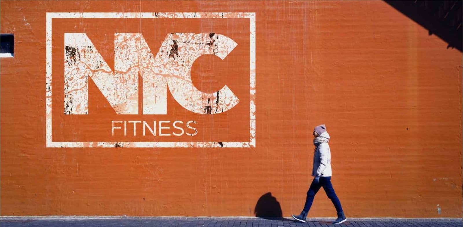
NYC Fitness Brand identity
The name
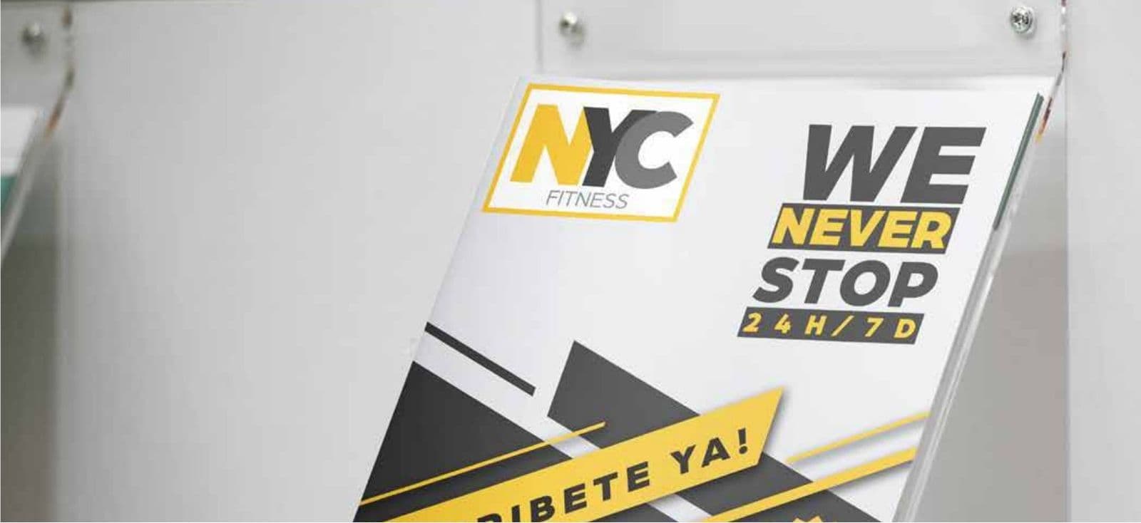
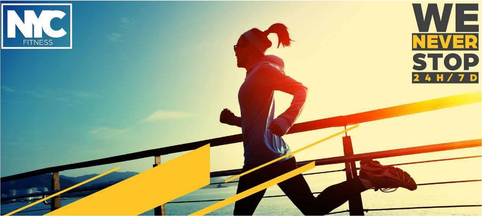
New York is the city that never sleeps, and a gym open 24 hours, 7 days a week, makes it its own. “NYC” is an acronym understood in any language and “Fitness” names the business plainly. “We Never Stop” turns the name into a slogan.
The idea
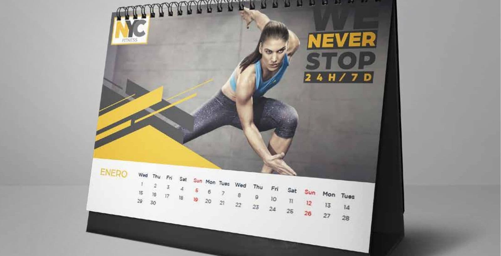
A gym with no closing time, for those who train at dawn or after work. The identity is pure New York street: thick lettering with a worn-paint effect on a brick wall, energetic posters and a calendar with no rest days.
The color
Yellow and black, like New York’s taxis and asphalt. Yellow is energy, alertness and movement; black, strength and discipline. The brick orange adds heat. High contrast: seen from afar and read in a hurry, just like a workout.
The identity at work

More brands
La Triguera
Brand book
Pollo Inn
Brand book
Urban Park
Brand book
Abita
Brand identity
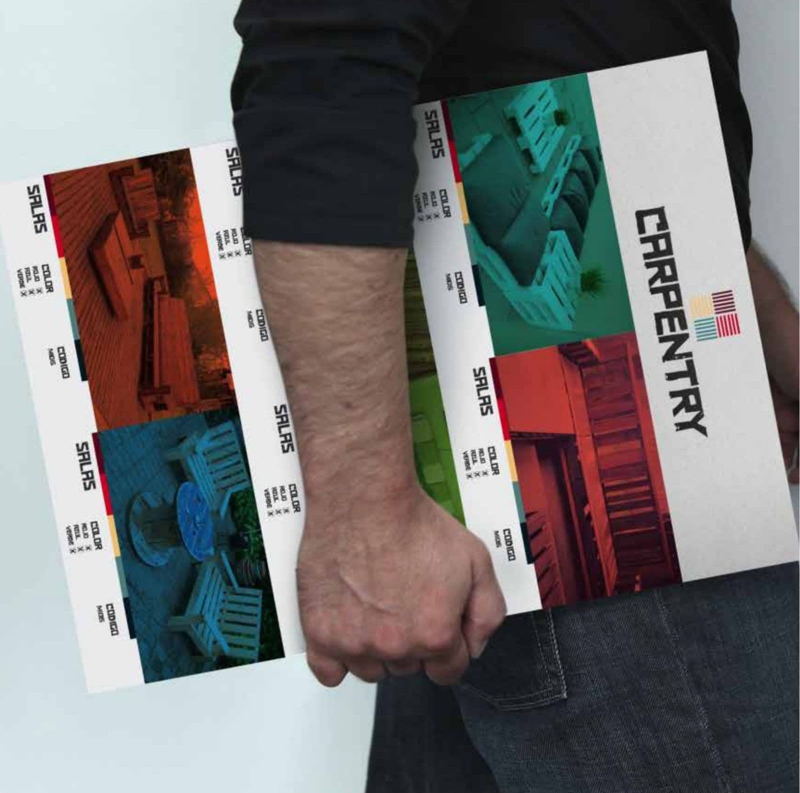
Carpentry
Brand identity
CarShop
Brand identity
E+G
Brand identity
El Secreto
Brand identity
Element Brokers
Brand identity

ERES
Brand identity

Frutopia
Brand identity
Little Feet
Brand identity
Manje
Brand identity
Megacar
Brand identity
Olmos
Brand identity
Totoru
Brand identity
Next step
Tell us what is holding you back.
We answer on WhatsApp. No forms, no waiting.
ebr@bancorp.com.mx+52 999 902 0247