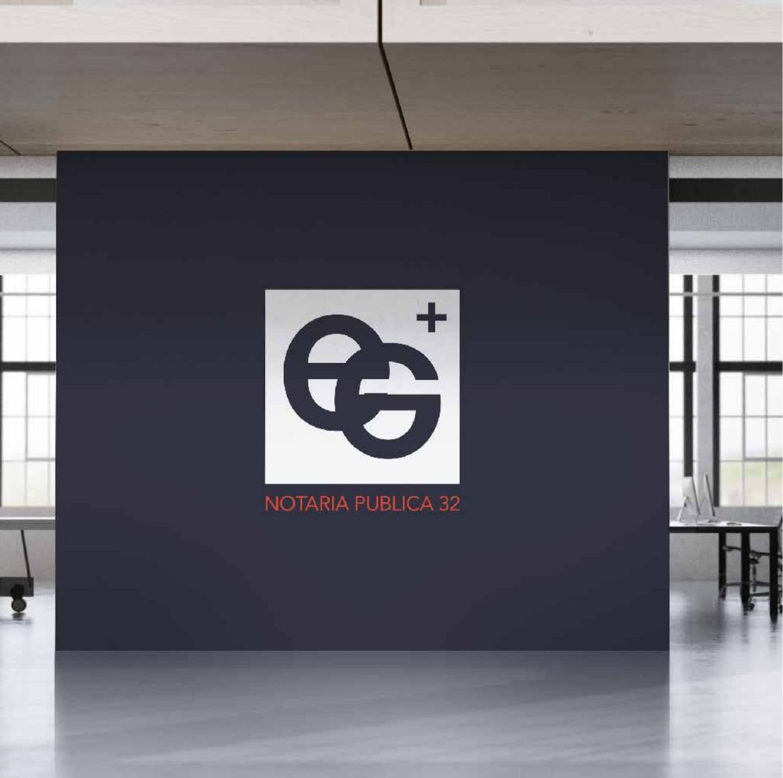
E+G Brand identity
The name
E+G: two letters and a plus sign. A short, neutral, office-style name that reads the same in any language and suggests addition: two voices, one guarantee. “Notaría Pública 32” follows as the subtitle with the official detail.
The idea
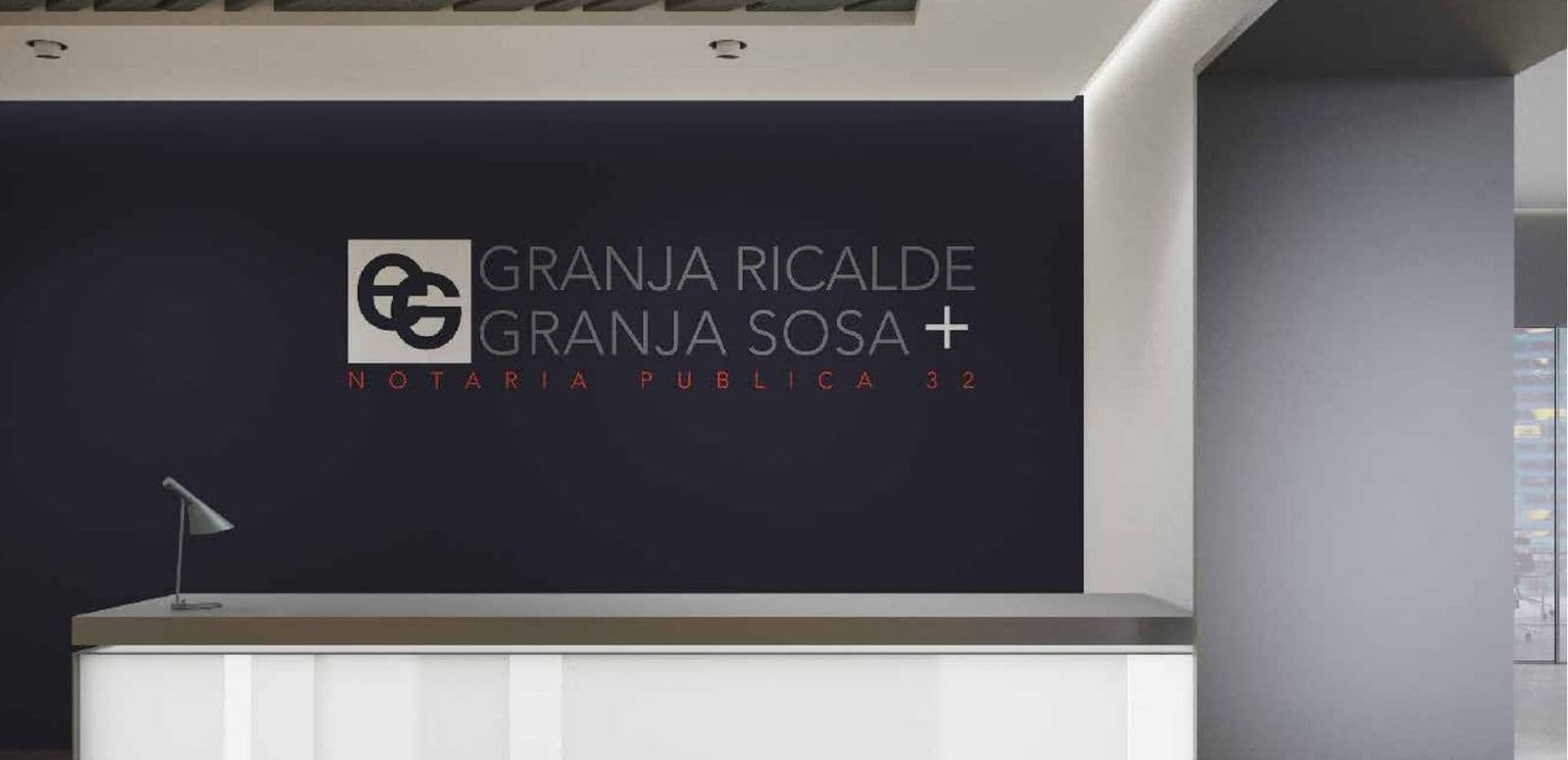
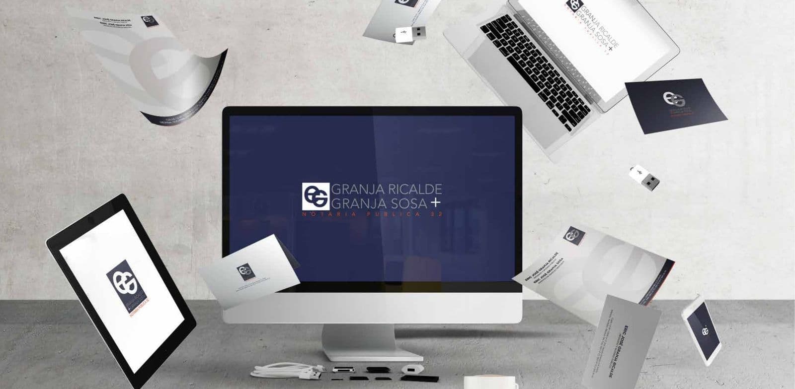
A notary office deals in public trust: its identity must look firm before it is read. The monogram overlaps the two letters like a seal and appears on walls, stationery and screens with the calm of a well-made document.
The color
Navy blue, the color of formality and fountain-pen ink, with silver and white for cleanliness. A single red accent marks the official detail, like the line of a seal.
The identity at work
More brands
La Triguera
Brand book
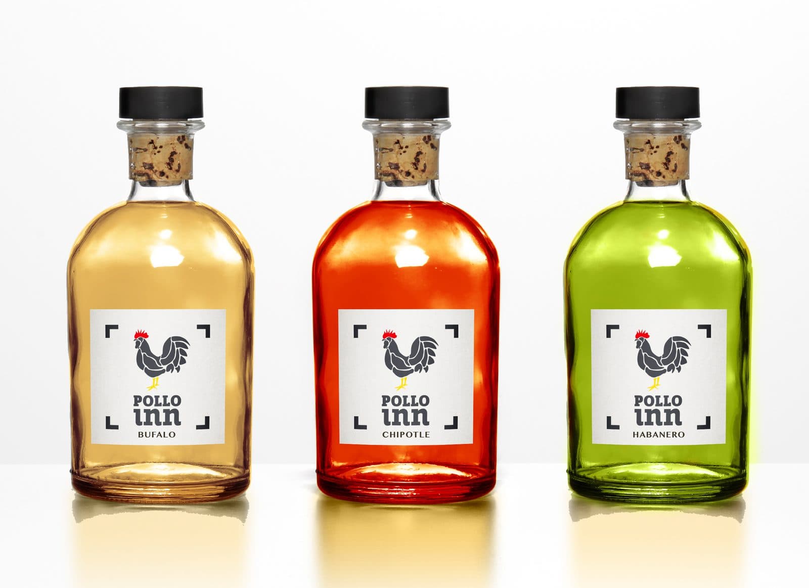
Pollo Inn
Brand book
Urban Park
Brand book
Abita
Brand identity
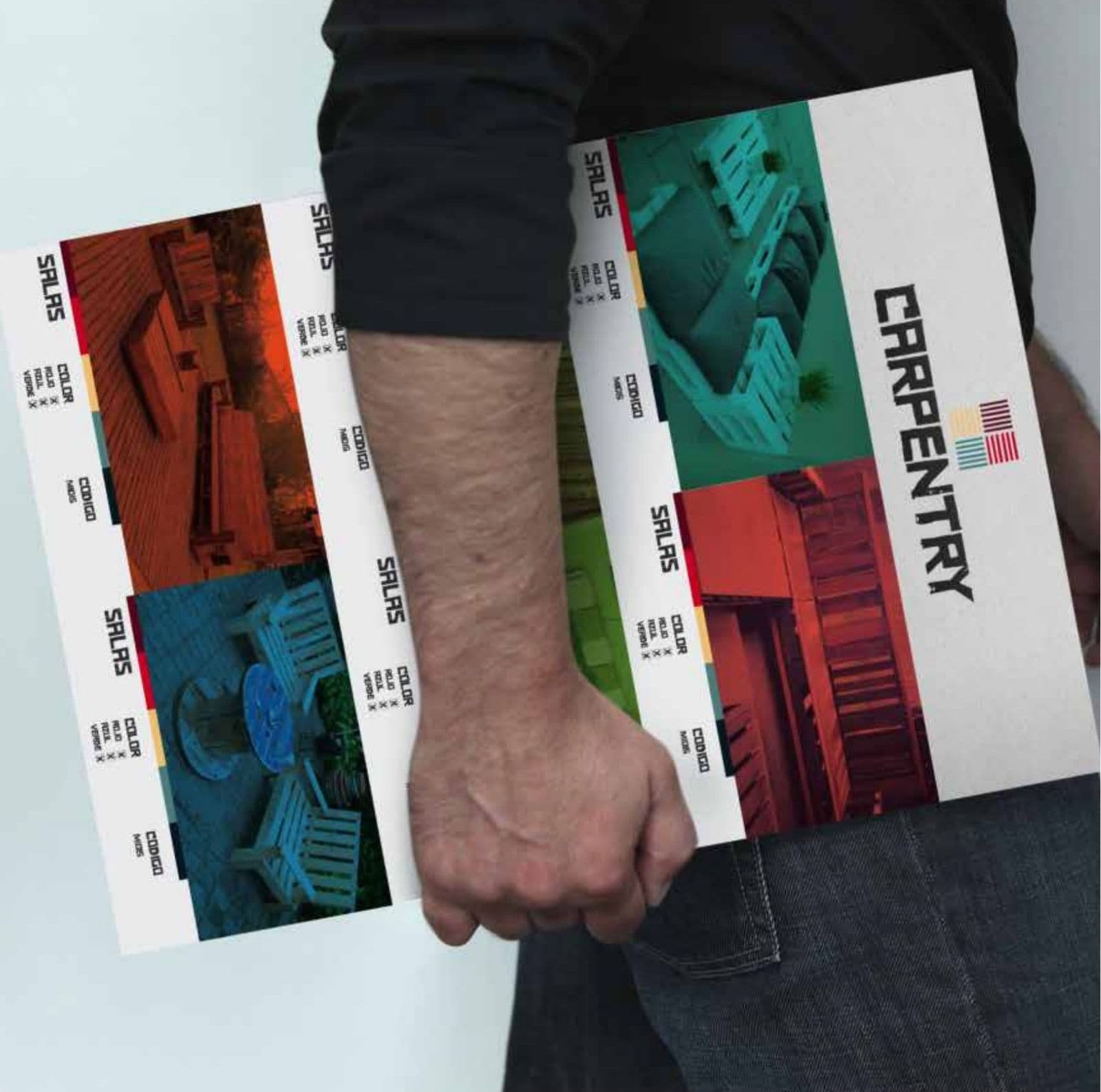
Carpentry
Brand identity
CarShop
Brand identity
El Secreto
Brand identity
Element Brokers
Brand identity
ERES
Brand identity

Frutopia
Brand identity
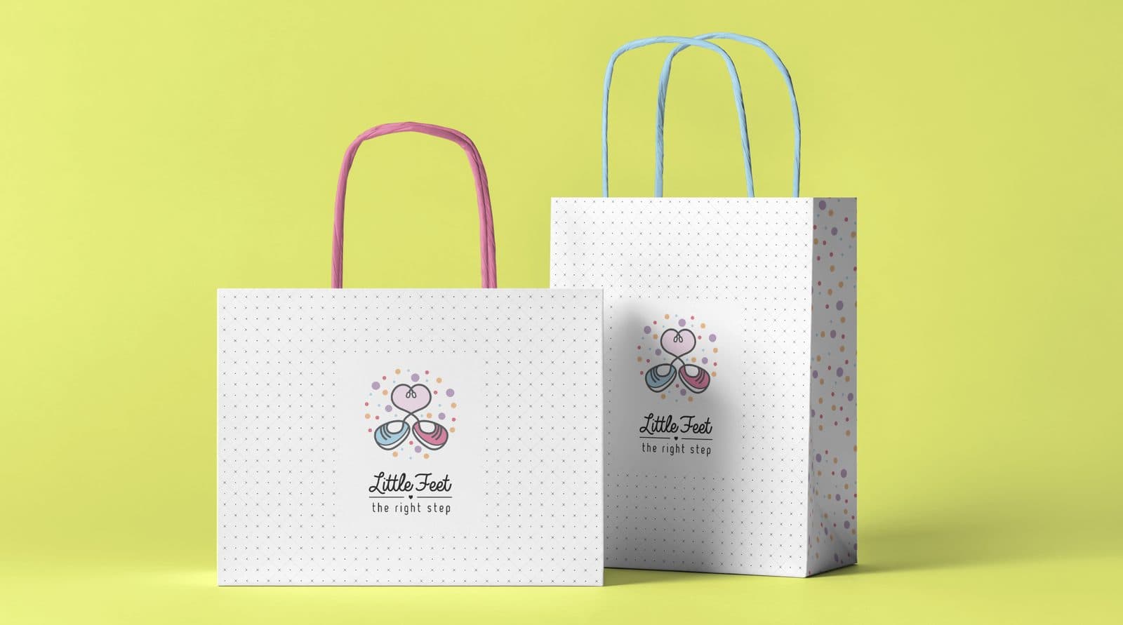
Little Feet
Brand identity
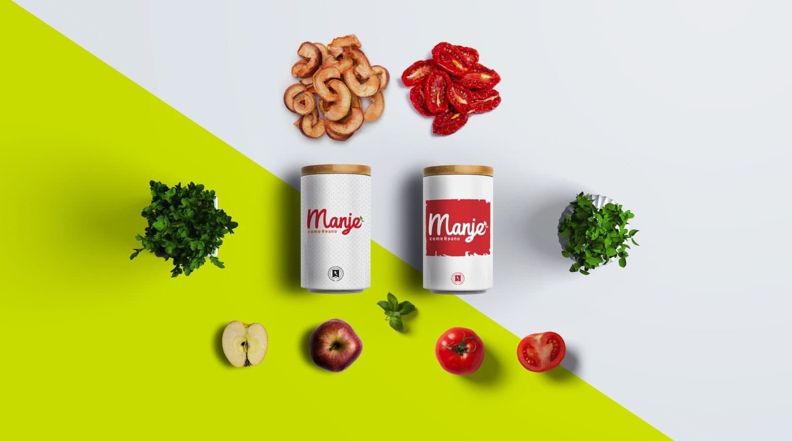
Manje
Brand identity

Megacar
Brand identity
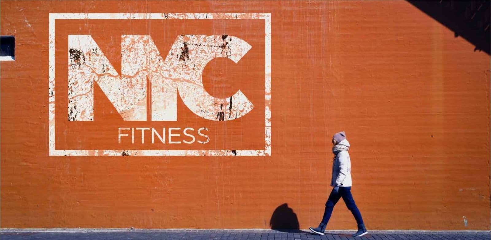
NYC Fitness
Brand identity
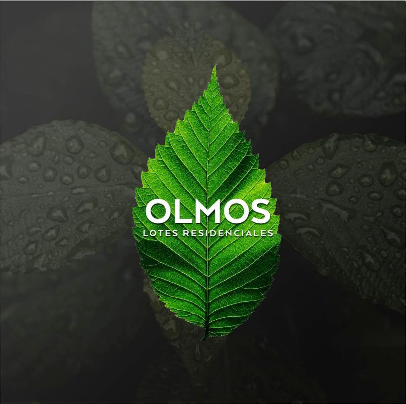
Olmos
Brand identity
Totoru
Brand identity
Next step
Tell us what is holding you back.
We answer on WhatsApp. No forms, no waiting.
ebr@bancorp.com.mx+52 999 902 0247