Olmos Brand identity
The name
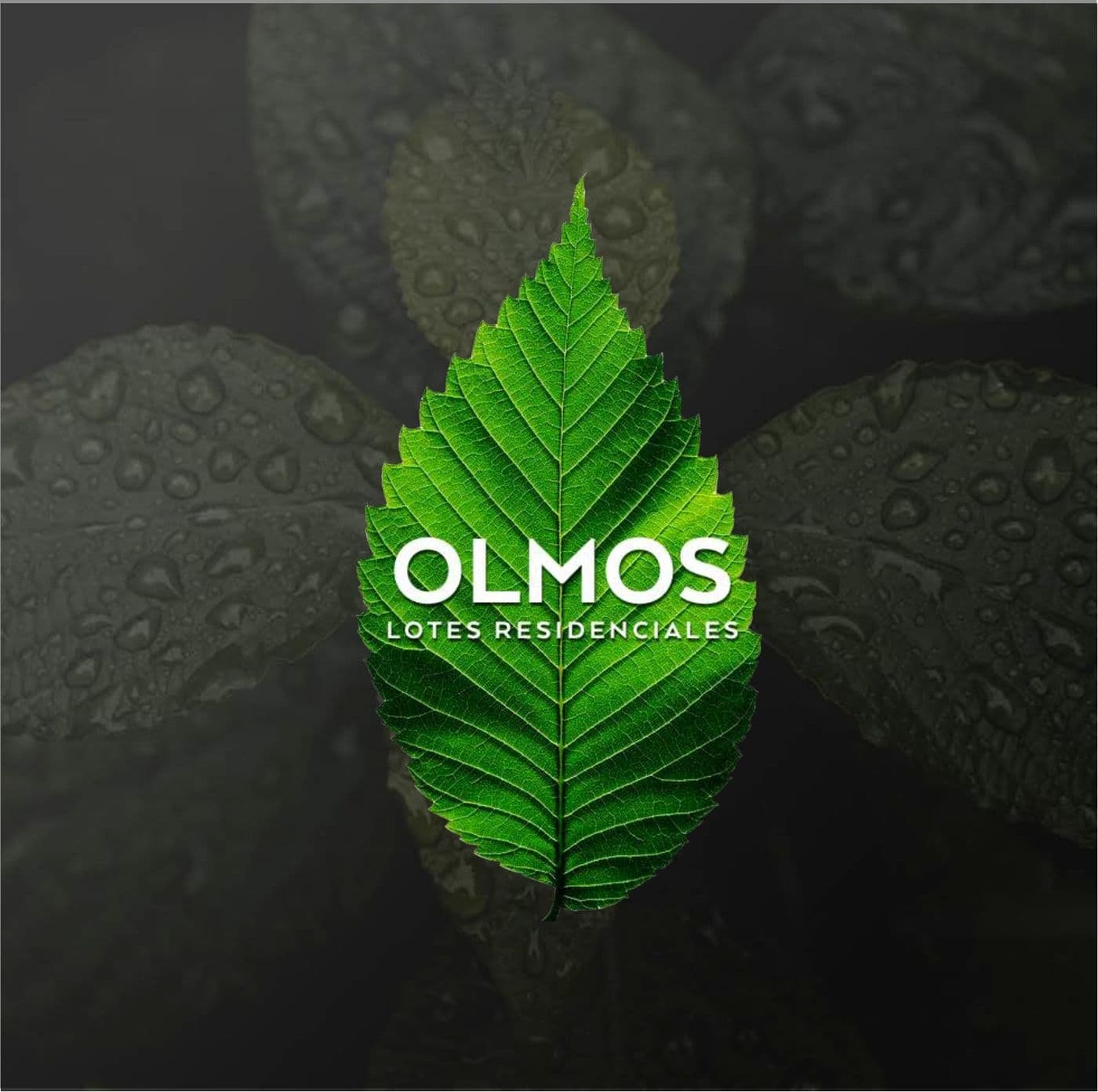
The elm is a tree of broad shade and long life. Giving its name to a residential lot is promising roots: a place to stay and watch grow. “Lotes residenciales” describes it plainly. Timeless, natural and universal.
The idea
A real, photographed elm leaf is the symbol, with the name living inside it. The brand does not illustrate nature: it uses it. Tumblers, a cap and a car with a leaf pattern take it into the daily life of someone buying land for their future.
The color
Green in every shade. Green is growth, calm and health, and in real estate it speaks of future security. On dark backgrounds the leaf glows; on mint green it turns fresh and approachable.
The identity at work


More brands
La Triguera
Brand book
Pollo Inn
Brand book
Urban Park
Brand book
Abita
Brand identity
Carpentry
Brand identity

CarShop
Brand identity
E+G
Brand identity
El Secreto
Brand identity
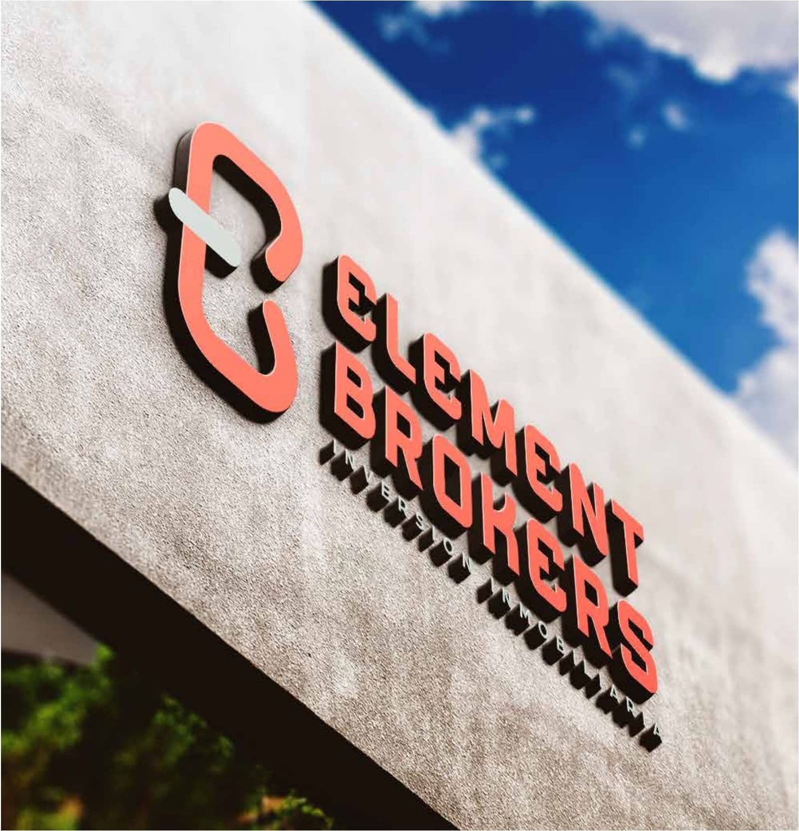
Element Brokers
Brand identity

ERES
Brand identity

Frutopia
Brand identity
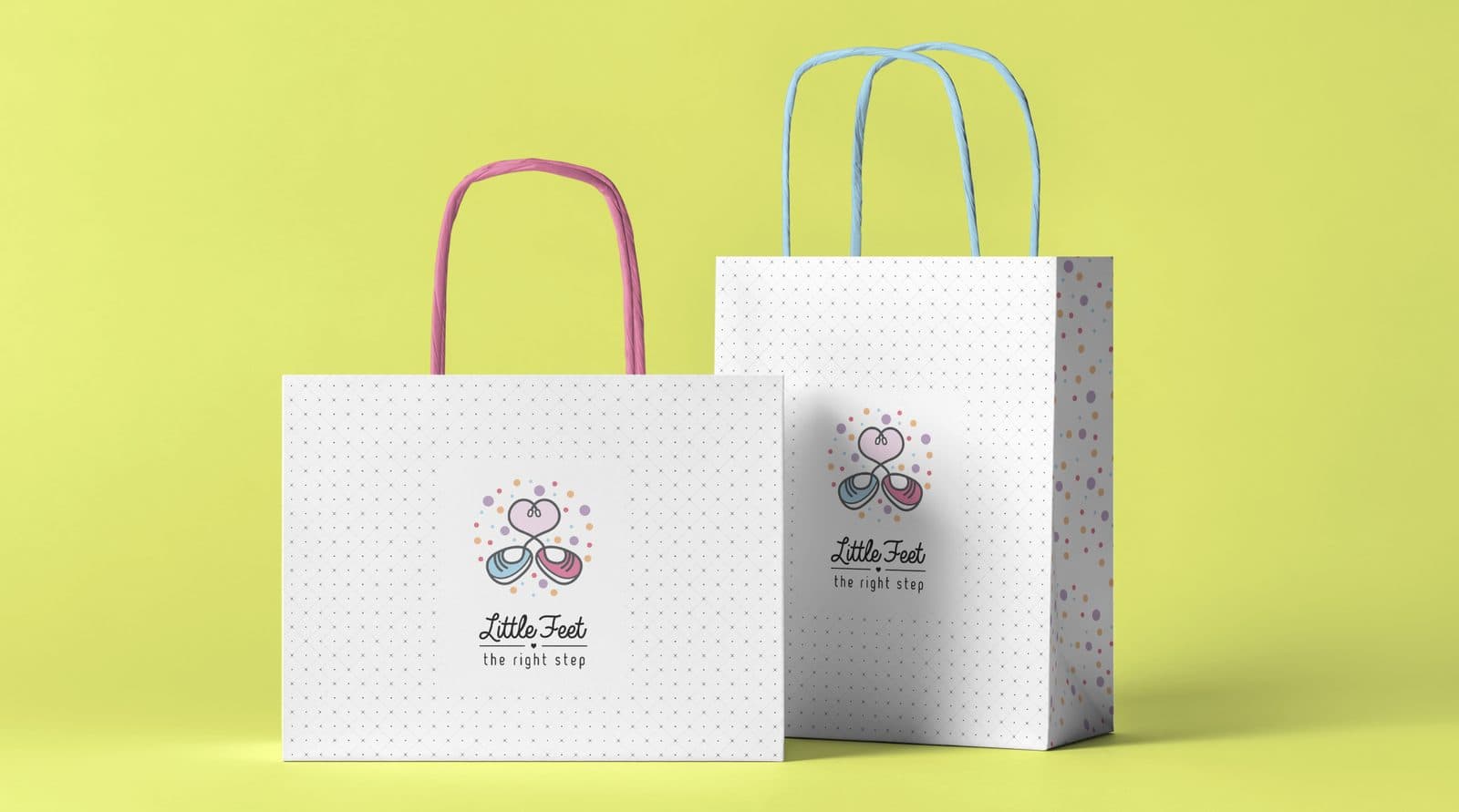
Little Feet
Brand identity
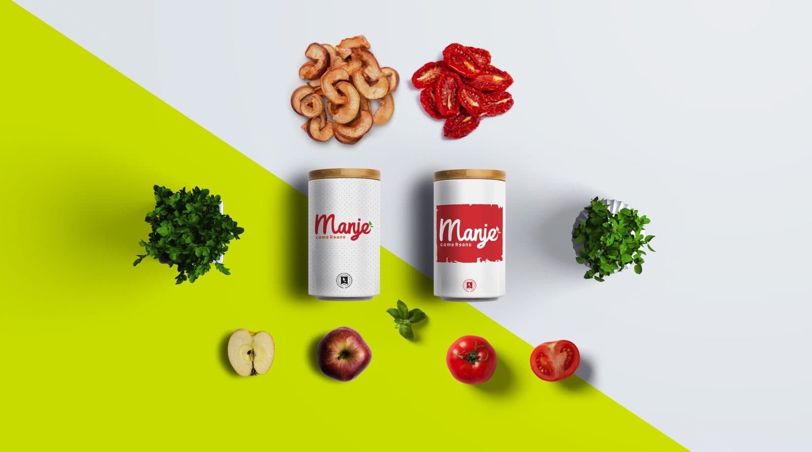
Manje
Brand identity

Megacar
Brand identity

NYC Fitness
Brand identity
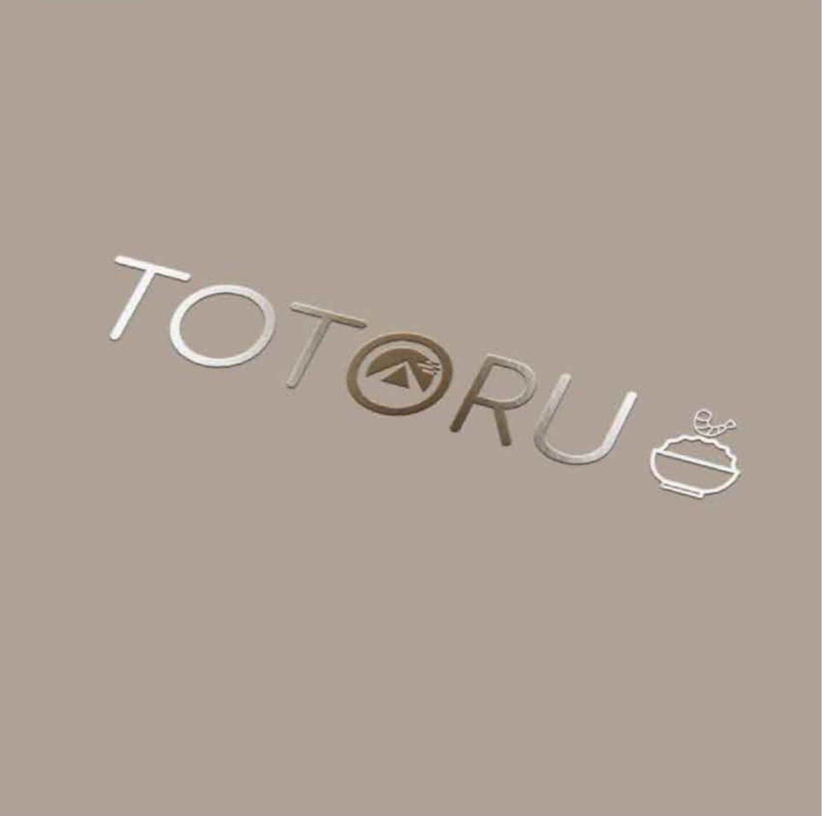
Totoru
Brand identity
Next step
Tell us what is holding you back.
We answer on WhatsApp. No forms, no waiting.
ebr@bancorp.com.mx+52 999 902 0247