Totoru Brand identity
The name
Totoru is an invented name, soft and short, with even syllables that stick in the memory. It does not describe: it evokes. Its Japanese air speaks to the craving, and the shrimp bowl icon clarifies what is eaten.
The idea
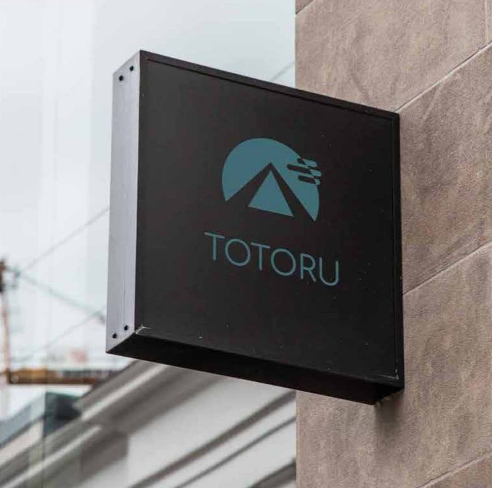
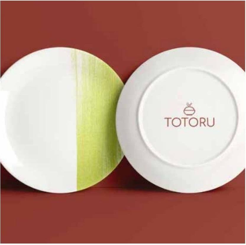
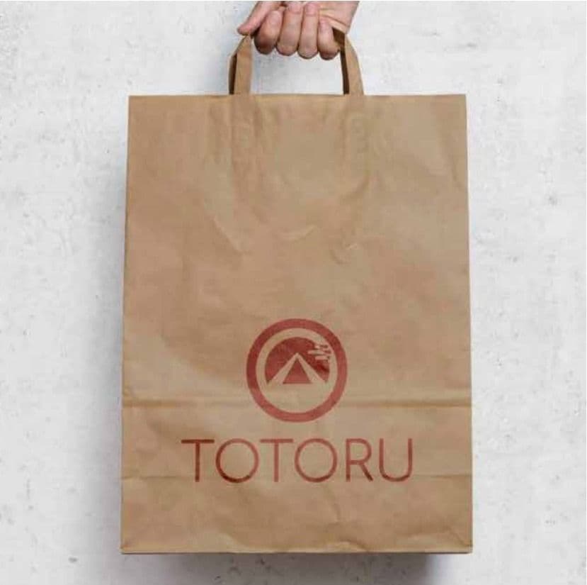
A circle with a mountain and a wisp of steam: the hot dish arriving at the table. A second icon, the shrimp bowl, lets the brand travel from sign to cup, plate and paper bag.
The color
Teal, terracotta and sand. Teal calms and brings sea freshness; terracotta warms and whets the appetite; sand, natural, gives it a rice-paper air. A serene palette, at odds with fast food.
The identity at work
More brands
La Triguera
Brand book
Pollo Inn
Brand book
Urban Park
Brand book
Abita
Brand identity
Carpentry
Brand identity

CarShop
Brand identity
E+G
Brand identity
El Secreto
Brand identity
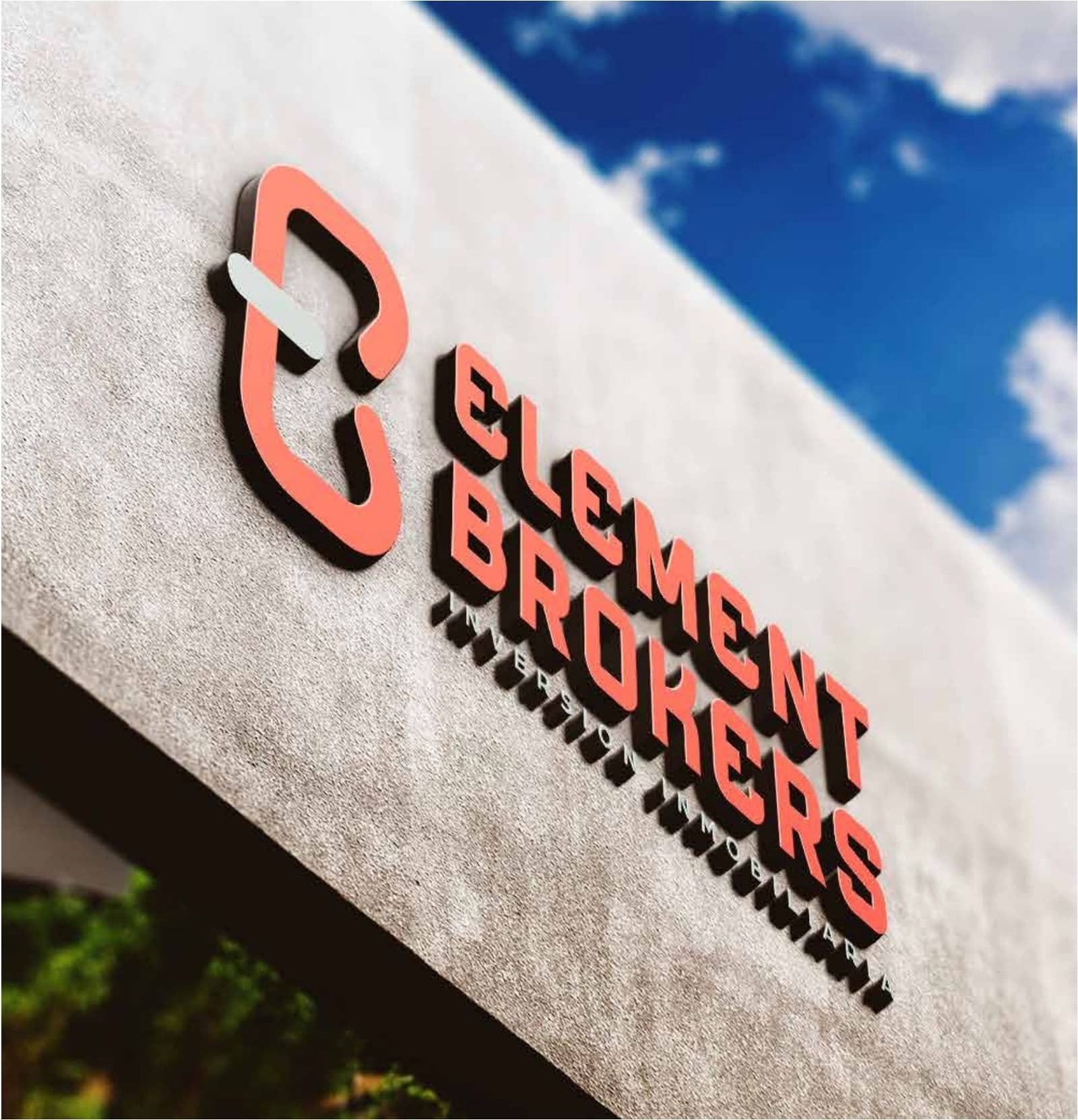
Element Brokers
Brand identity

ERES
Brand identity
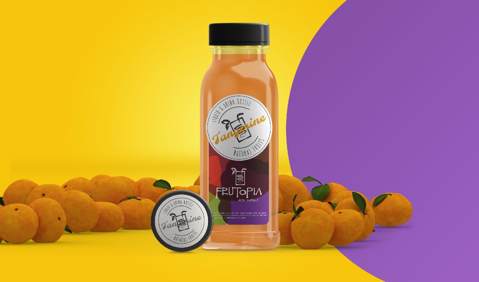
Frutopia
Brand identity
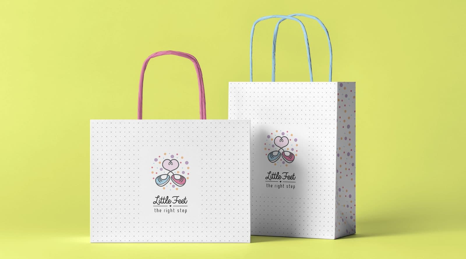
Little Feet
Brand identity
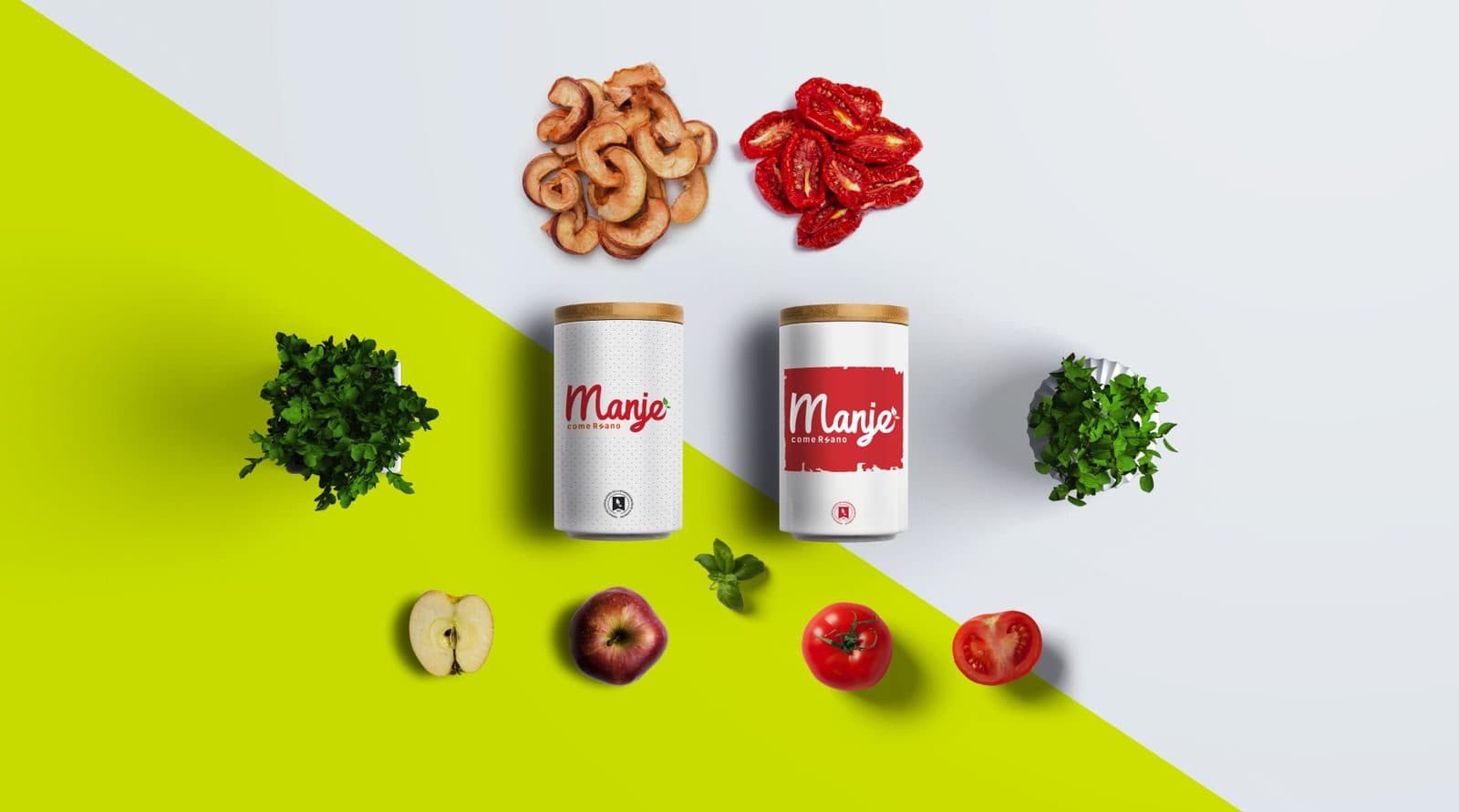
Manje
Brand identity

Megacar
Brand identity

NYC Fitness
Brand identity
Olmos
Brand identity
Next step
Tell us what is holding you back.
We answer on WhatsApp. No forms, no waiting.
ebr@bancorp.com.mx+52 999 902 0247